In my last post on COVID-19 I have shown how to write the John Hopkins University dataset to a SQL Server database:
This post shows how visualize the data using the 3D Map feature of Microsoft Excel.
Visualizing the COVID-19 data using Excel
So it all starts with getting the data into an Excel Sheet. From the Ribbon Bar you select ...
- Data -> Get Data -> From Database -> From SQL Server Database
... like this.

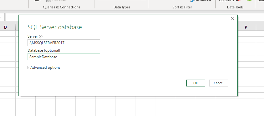
In the Dialog Box you then enter the Server and Database. We have used the database name SampleDatabase in my article on writing the dataset to the SQL Server.
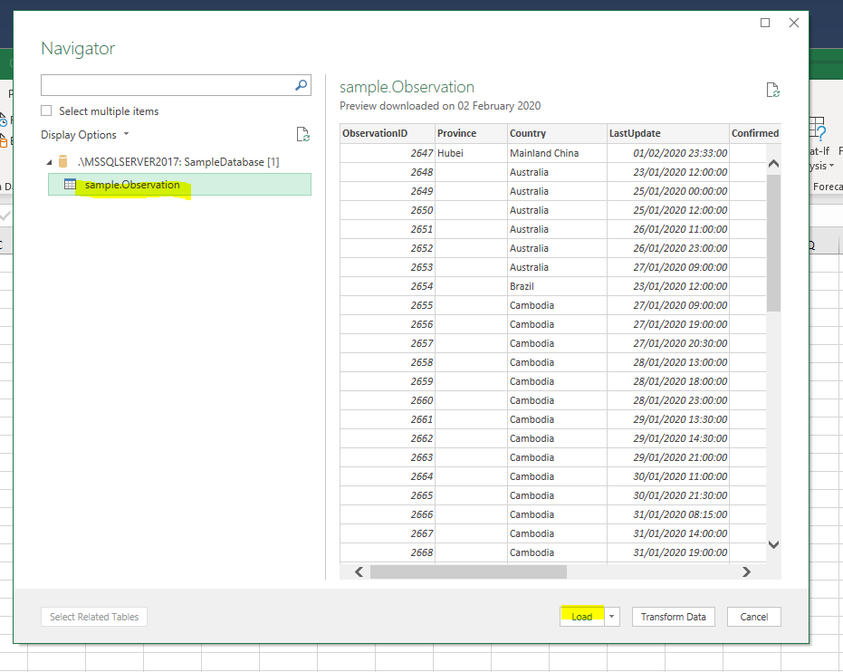
If you have successfully entered the connection details, then select the sample.Observation
table and click the Load Button.
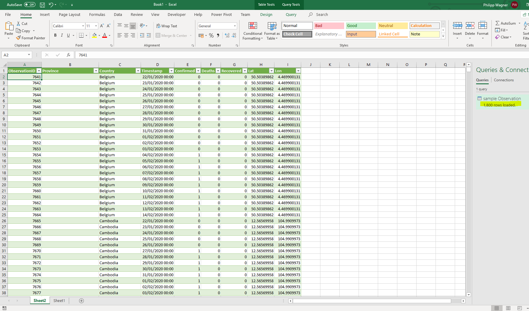
Excel will then load the dataset into a new Sheet it calls Sheet2 initially. The right hand pane will show you the number of rows loaded, and errors if any.
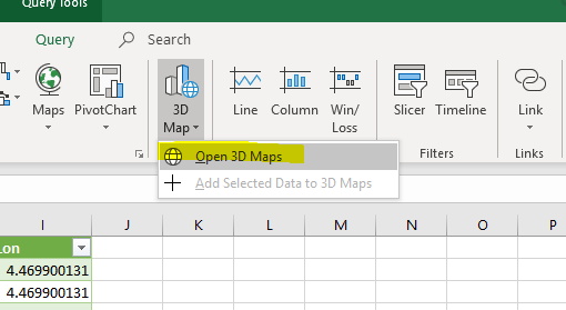
Now from the Ribbon Bar you create a 3D Map by navigating to ...
- Insert -> 3D Map -> Open 3D Maps
... like this.
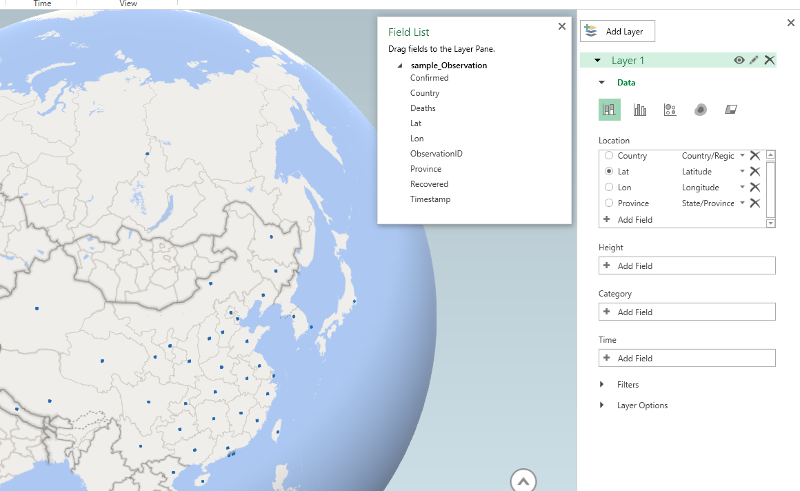
Microsoft Excel will now automatically load the data from the Sheet into the 3D Map. On the right pane you can see, that it already correctly mapped the columns Country, Lat, Lon and Province. And some data points are already displayed in the map.
Now let's configure the 3D Map to make use of the data!
- In the Ribbon Bar I first select Flat Map to get a 2D projection of the world.
- In the Data section of Layer 1 I change the visualization to Bubbles.
- In the Size section of Layer 1 I am adding Deaths (Maximum), Recovered (Maximum) and Confirmed (Maximum).
- In the Time section I am configuring to use the Timestamp column.
- In the Layer Options I am adjusting the color scales, so it better matches colors of official pages.
Once I am done, I am finally configuring the Tooltip to show useful data.
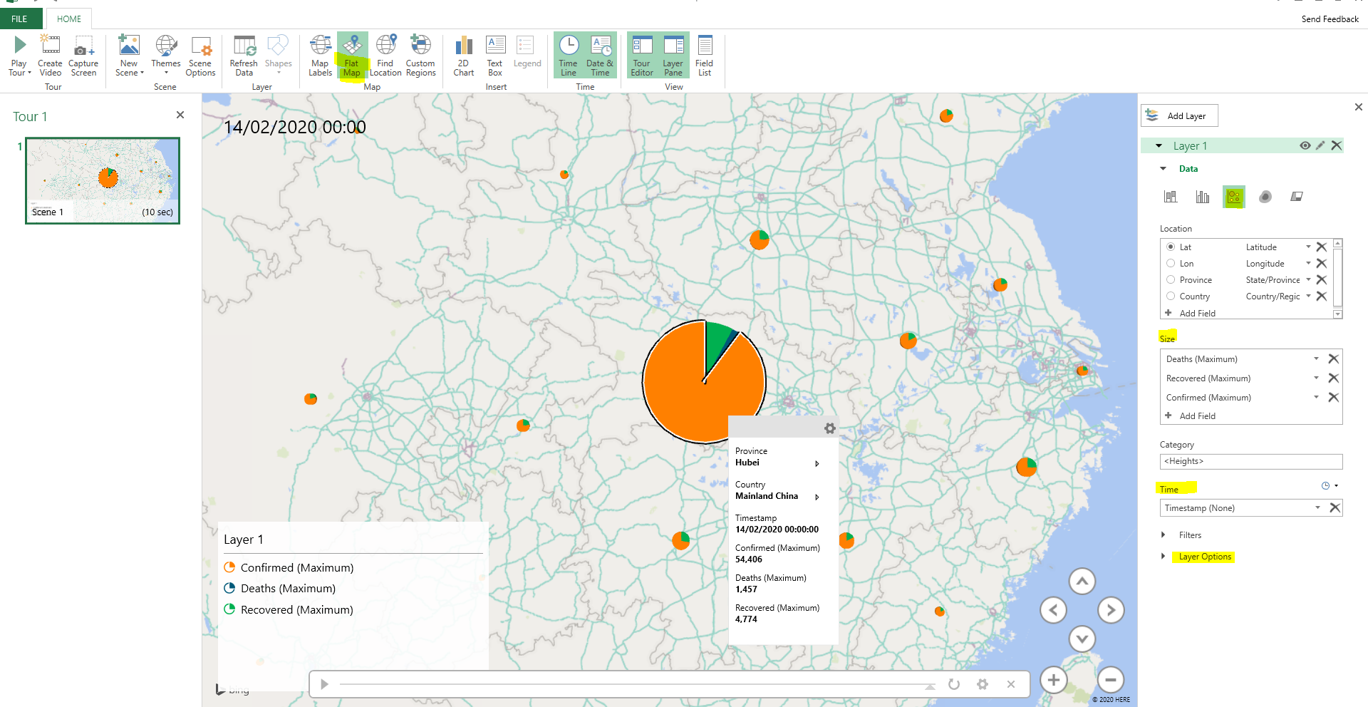
If you now press Play Tour from the Ribbon Bar you can see how the distribution behaves over time.
Conclusion
Microsoft Excel makes it easy to build simple visualizations of the COVID-19 dataset, without putting any energy into programming or data shaping. You can jump through any point in time using the 3D Map time slicer and run a tour, to see how the distribution evolves.